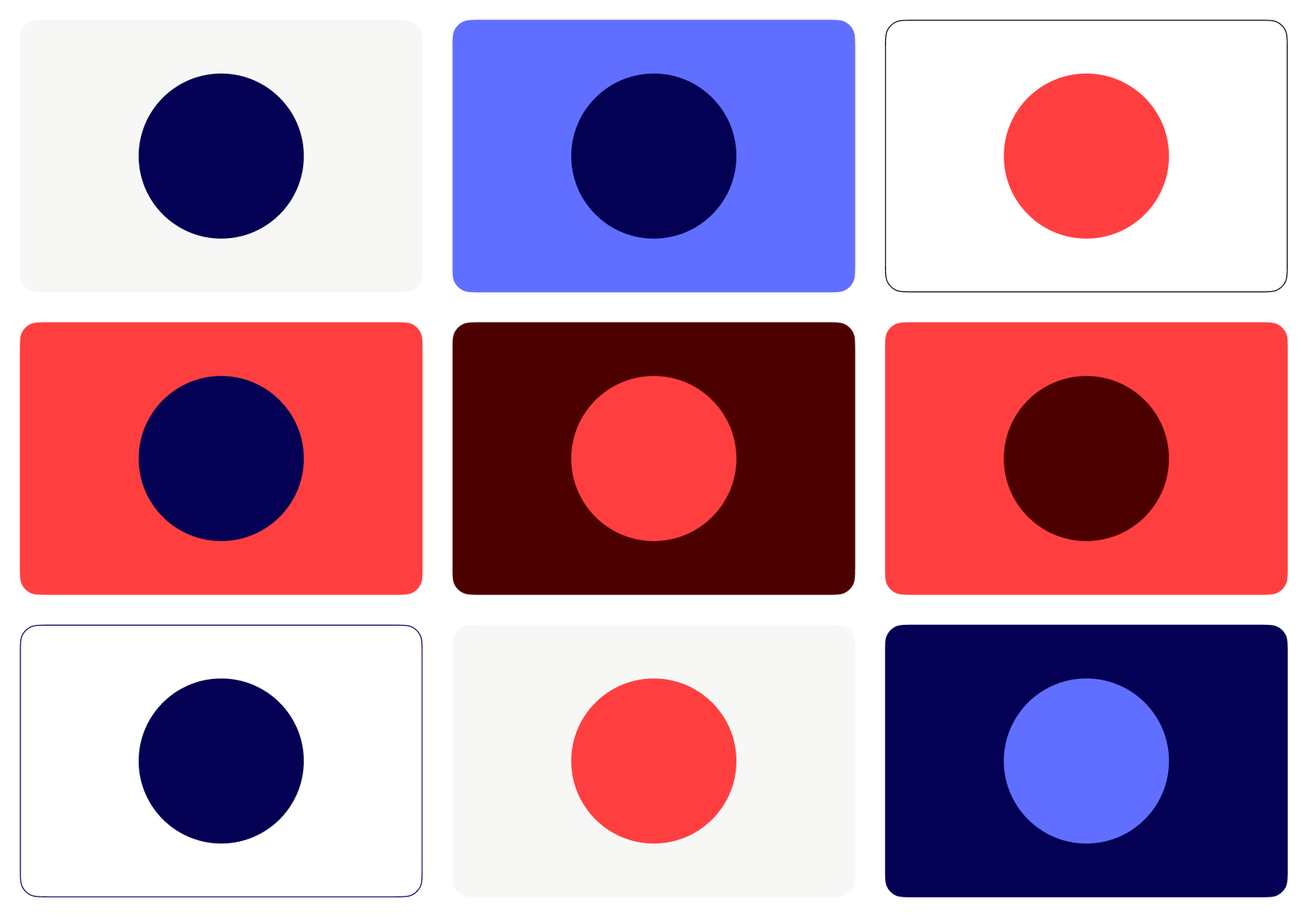
Our colour palette is bold and bright to help us to stand out in a crowded landscape. We are a red, blue and white brand and our specific colours have been chosen to feel contemporary, warm and energising.
Each colour has several tints that can be used in conjunction with our primary palette to create harmonious design applications.
Primary Palette
Our signature Bright Red takes centre stage, shaping a bold yet friendly visual identity. It’s all about energy and warmth—unmistakably us. Accents of blue bring confidence and calm, striking the perfect balance.
Bright Red
Bright Blue
Deep Red
Deep Blue
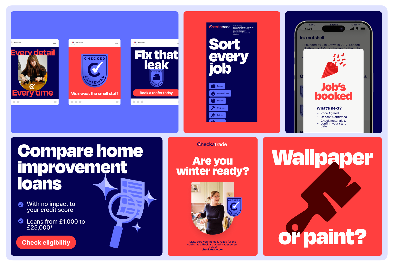
Primary palette in use
In marketing, we lead with confidence—bold, full-bleed colour makes an instant impact. Our primary palette isn’t just a backdrop; it brings the punch, creating a strong, recognisable presence across all brand communications.
Colour tints
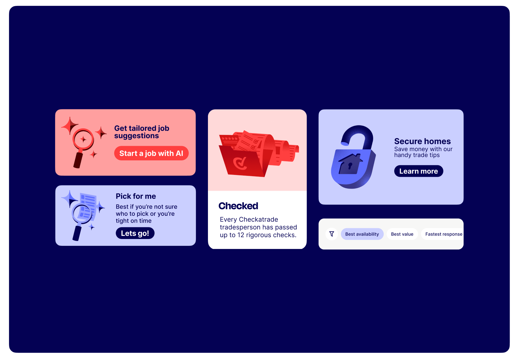
Tints and shades are in addition to our primary palette and provide extra versatility throughout the brand system. We have an expanded set of tints and shades for use in app and web. More details of these are available in the UI section of this document.
In digital spaces like app and web, we keep things clean—primarily white, with red and blue accents for clarity and impact.
Our use of bright colour flexes with intent—bold when we need to grab attention, subtle when we step back to let content shine.
We keep the colours tonal, so when we’re using a blue tint background we use a blue CTA in combination. The same with a red tint and a red background.
Pale Red
Light Red
Dark Red
Pale Blue
Light Blue
Dark Blue
Utility Colors
For the full utility colour palette used in product — neutral, accent, positive, and caution ramps — see the Colours token reference.
Colour combinations
Our brand colour palette offers many colour combinations, therefore it is important that the correct colour combinations are used.
These colour combinations help us create rich, lively designs. Alternating between light and dark backgrounds keep our brand fresh and make sure we always look our best.
To ensure the best contrast and colour balance, always use the colour combinations provided on this page.
Ooo very nice!
Navy on Light Gray (1/9)
Click arrows or use keyboard ←/→ to navigate
#F5F5F5Background#040154Text