Typography
Our typography is Checkatrade's visual voice. Our display typeface, Degular, brings an approachable personality and character to our identity.
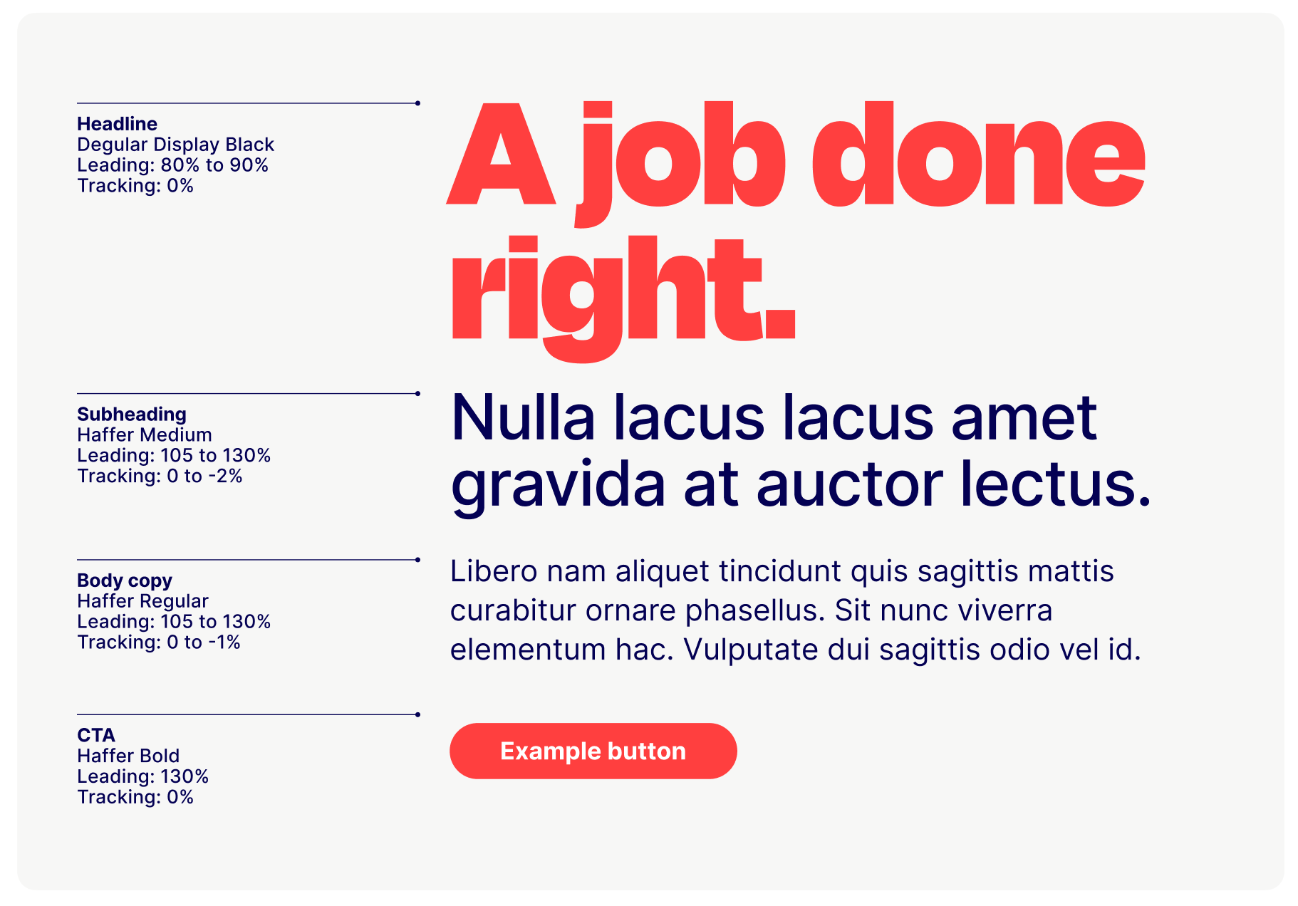
We adjust our type sizes and weights to create hierarchy. We use Degular Display for headline copy. Body copy and CTA’s use Haffer.
The recommended sizes and measurements on this page are a guide to correct typesetting. Messaging should be typeset on a case-by-case basis to make sure it's always legible.
Degular
Our brand’s headline typeface is Degular Display. It communicates our assurance in a warm and approachable way. We use it in two different weights: Bold and Black. It’s one of our distinctive visual assets.
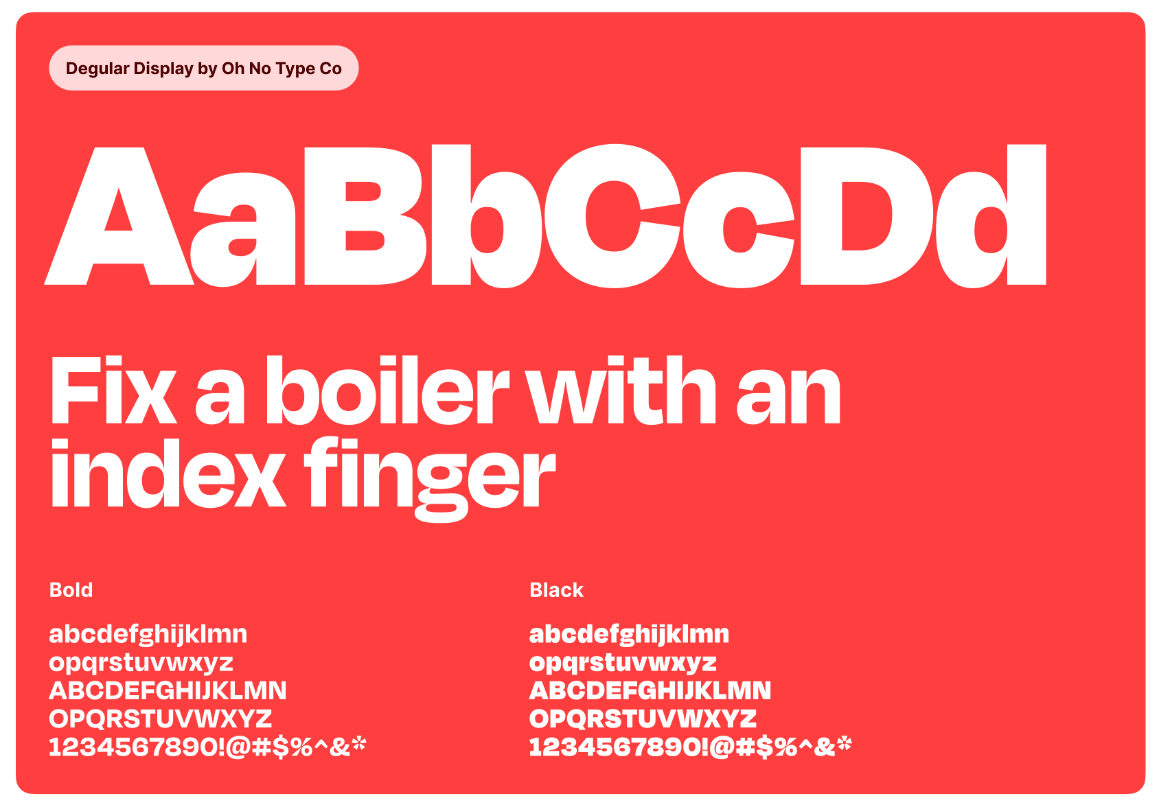
Degular Black
Degular Bold
Haffer
We also have a secondary typeface called Haffer. It’s highly readable at small sizes, and helps gives our identity a contemporary look. It’s a versatile, functional and robust typeface that’s a breeze to read on both digital devices and in print.
We use Haffer Regular, Medium and Bold for detailed messaging and long sections of body copy across digital and print applications.
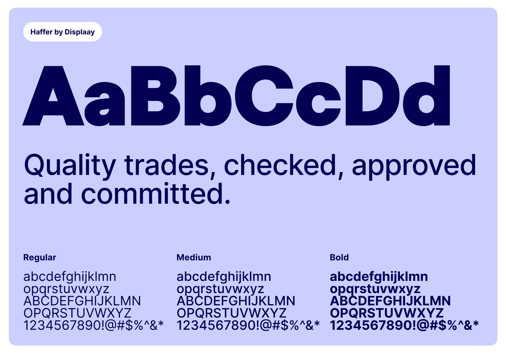
Haffer Bold
Haffer Medium
Haffer Regular
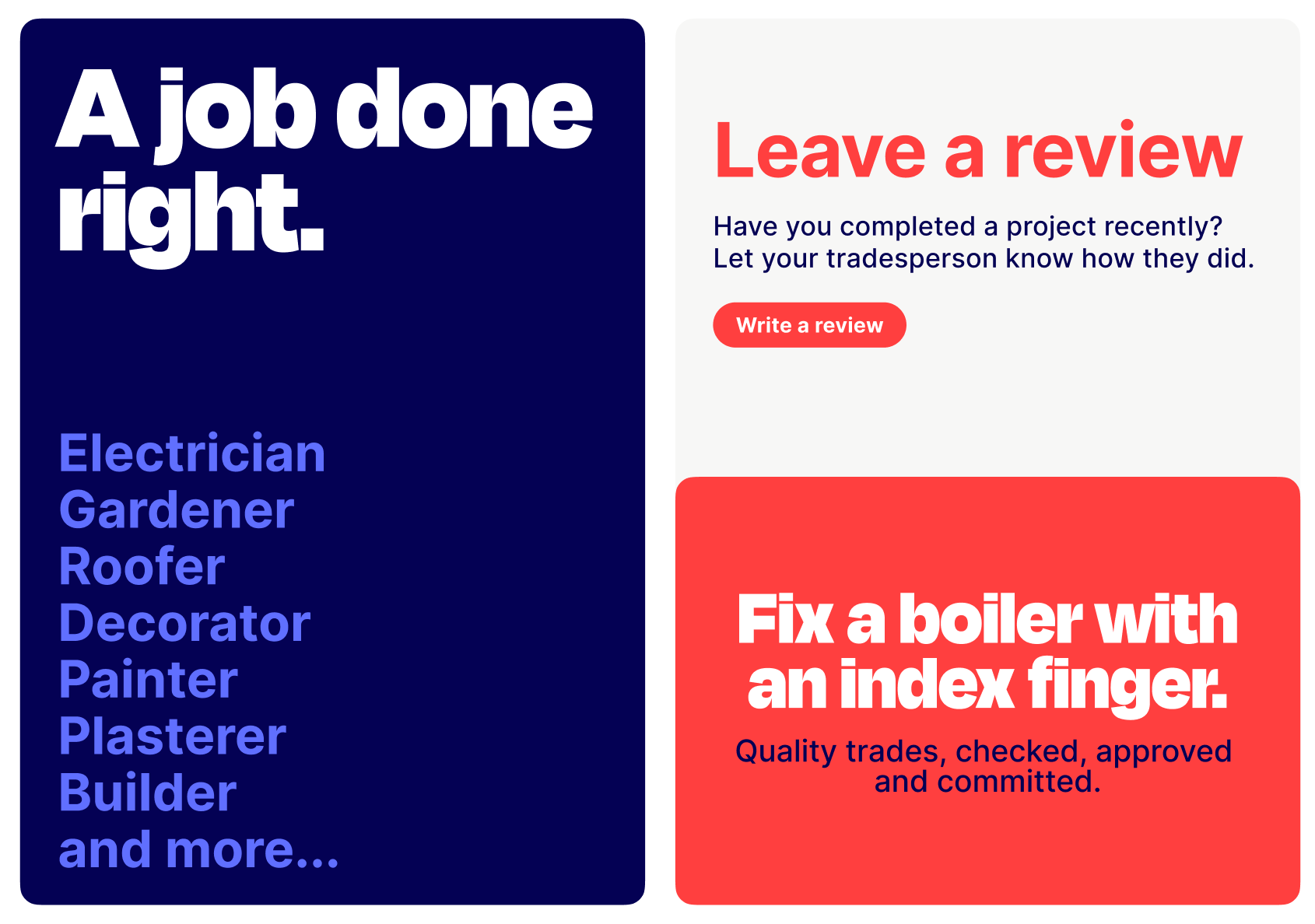
Typography in use
Here’s a range of examples that show how to use and mix together our brand typefaces effectively.
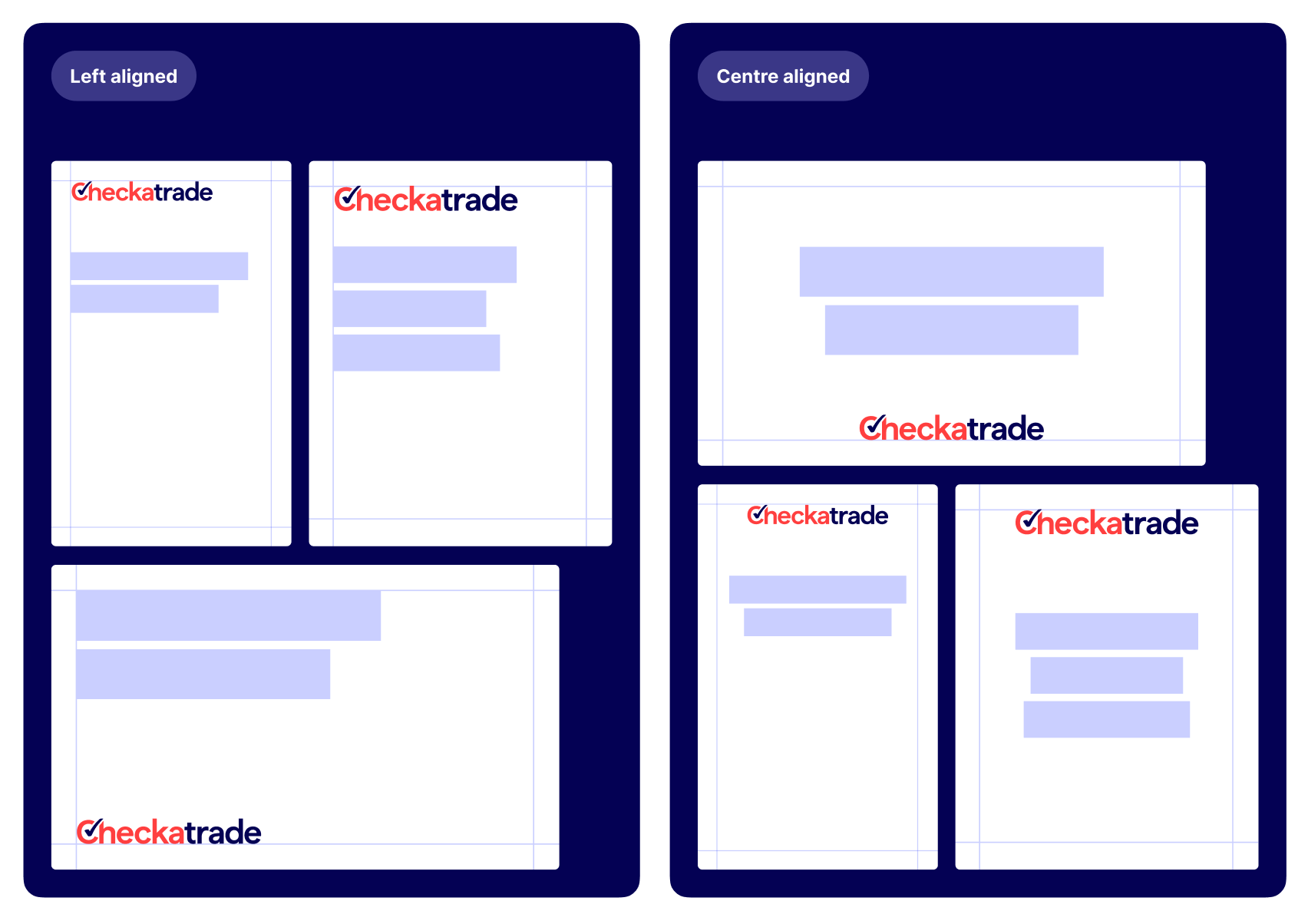
Alignment and layout
In most cases we left align or centre our typography on the page. In both cases, we always align headline and logo.
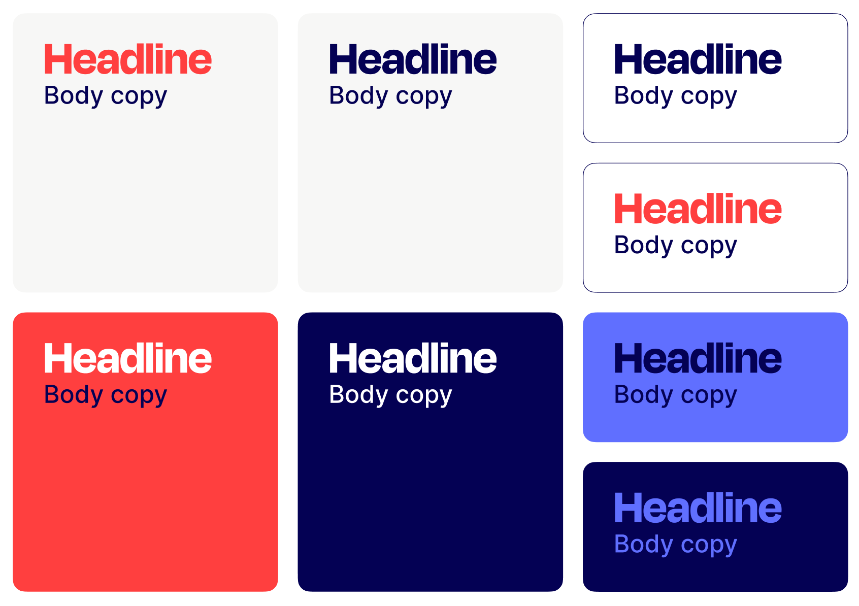
Use of colour
Some colour combinations are more successful than others. Here there are the best colour pairings for typography. These recommended colour combinations guarantee enough contrast and accessibility.
Fallback fonts
We use our brand typefaces Degular Display and Haffer wherever possible in designed channels and touchpoints.
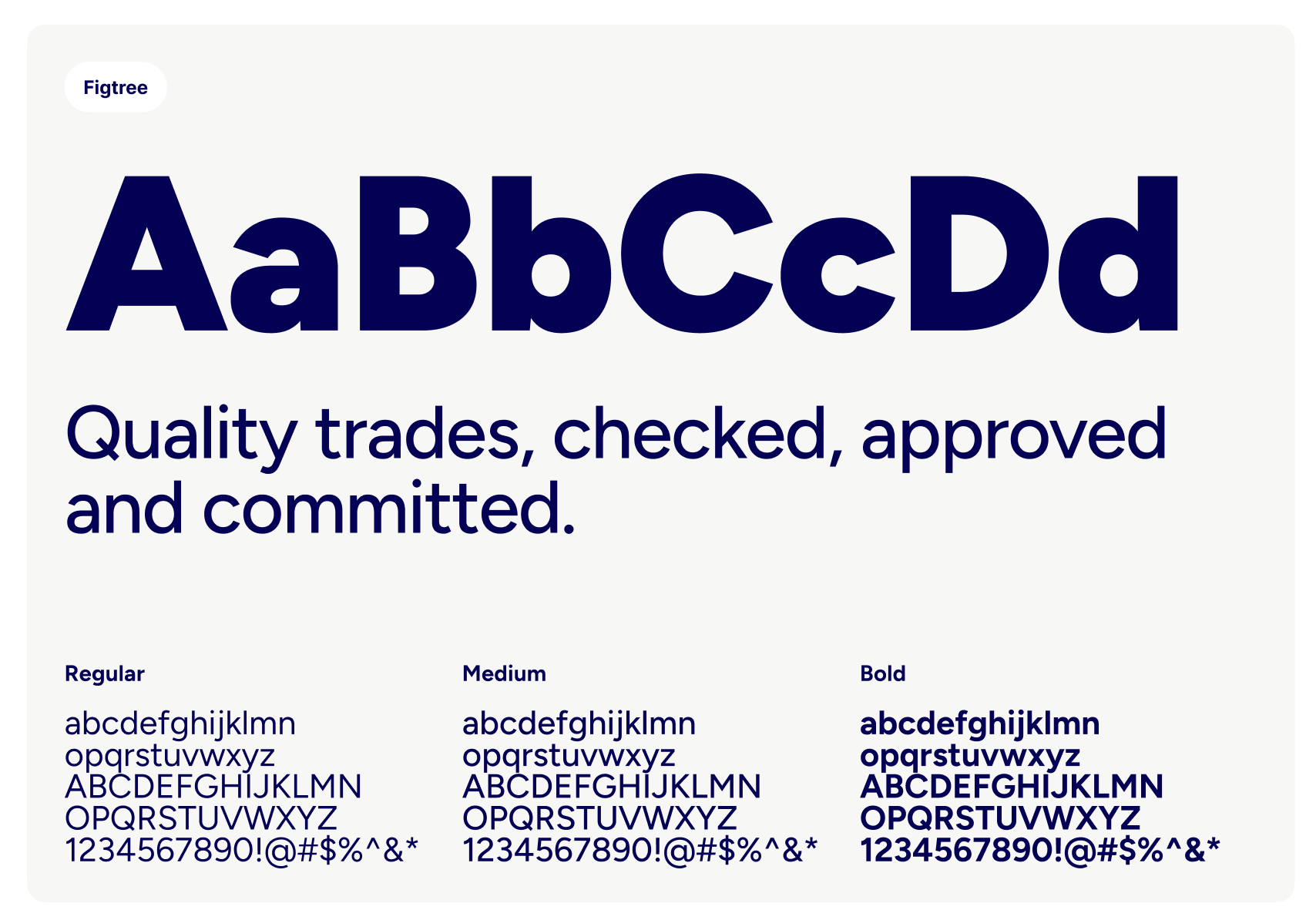
When creating internal documents with the Checkatrade brand, such as presentations, we use Degular Display in combination with Figtree as a replacement for Haffer.
In instances where it's not possible to use our brand fonts, for example in email marketing where we rely on default system fonts, we use Arial as a universal sans-serif alternative.